
About
Languages of art ↔ Art of languages
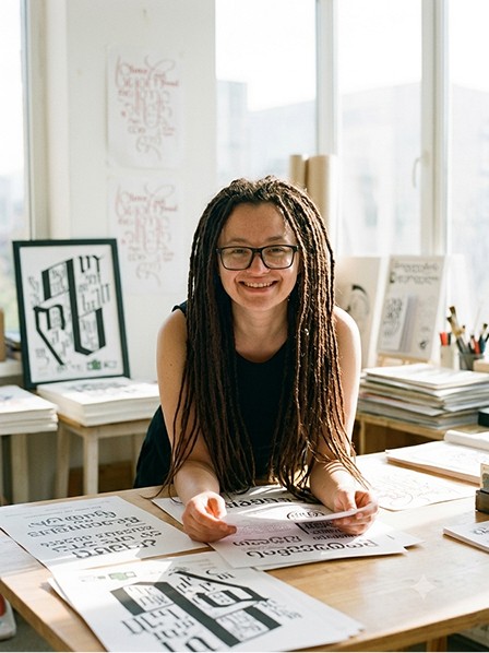
Nelli Chupin (Kamaeva) makes things out of alphabets — posters, zines, study guides, and lately installations you can step inside. Her background is in maths, so she handles language without much reverence — taking it apart, seeing how it holds together, and putting it back.
When letters lose their meaning and, simply, sound. She leaves the meaning open — language doesn't hold still anyway.
Her artworks & posters have been awarded and exhibited internationally, from Graphis to Poster Stellars.
Nelli Kam Chupin
Art statement
I'm a poster designer and visual researcher who treats the world's writing systems as a material. My medium is the poster, extended into zines and study guides and, increasingly, into installations and performances where the viewer takes part in the experience rather than watching it from a distance. Across all of them I work with one thing: the world's alphabets — familiar and unfamiliar, inherited and invented.
My focus on language began with its shapes, and I came to it from an unusual direction. I grew up among different alphabets and have lived across several language environments, and my training is in applied mathematics and interface design. So I treat a script the way I'd treat any system: I take it apart, work out how it holds together, and reassemble it. Many of my pieces start as something useful — a cheat sheet, a language manual — and stay useful even as they turn into art.
What interests me is the moment writing stops being read and starts being felt: when letters lose their meaning and become rhythm, texture, sound. I care less about delivering a message than about the instant a stranger's alphabet stops looking like a wall. Much of this work grows out of a multilingual club I run as a living laboratory. I leave the meaning open — language doesn't hold still anyway.


Bio
Nelli's posters start from ideas, not pictures: a scientific concept, a social knot, a cultural quirk, sometimes something gloriously absurd. She builds the answer out of experimental typography and the world's writing systems — Latin, Cyrillic, Georgian, and whatever else the idea needs — with a dry sense of humour. The aim is a poster you read twice: once for the image, once for the catch.
Language is the thread through all of it. She is drawn to alphabets as living systems rather than decoration — which is also why she has built a method for learning several languages at once and designed a primer for learning Georgian. It traces back to starting out in mathematics: she still thinks in structures, symmetries and systems, and posters turned out to be the most satisfying place to put that.
Her work has been shortlisted in more than fifty international competitions and shown at biennials and festivals across several continents — gold and bronze at PosterStellars, a prize in Lublin — and published by Slanted (Posters Can Help, Experimental Type 3.0) and in biennial catalogues.
She studied typography at Antwerp's Plantin Institute and poster design in Peter Bankov's schools, Typomania.
She likes building rooms for posters as much as making them: she runs Poster Every Day, an international poster project, and has curated exhibitions in Tbilisi — from a poster night in a 130-year-old bar to a permanent show in a library lounge.

Based in
Belgrade, Tbilisi
Trained as
Mathematician (MA, applied maths)
Past life
Wrote code for satellite-radiation data
Runs
A club that practises 14 languages at once
Current project
Multilingual zines
Believes
A poster's job isn't to be read
CV
Awards & Honours
2026 — Communication Arts, Design Annual — named (via the "Twice Seen" New York exhibition, Art Innovation Gallery).
2025 — International Poster Biennale in Lublin — 3rd Prize, Krosno Design Festival category.
2025 — ArtU / Arts for All (TransLaCore) — Finalist.
2023 — PosterStellars (USA) — Gold & Bronze.
2023 — Oesol International Typography Awards (Korea) — prize / honour.
Shortlisted or selected in 50+ international poster competitions.
Exhibitions, Biennials & Competitions
30-plus competitions and biennials,
20-plus exhibitions, across Europe, the Americas, Asia and the Middle East — Lublin, Lahti, Sofia, Trnava, Rzeszów, Mexico, Ecuador, Uruguay, USIPB, Tokyo TDC, Madrid Gráfica, Nanjing, Bologna, Korea's B.I. Biennale, and more.
Early & Formative Work
School years (roughly grades 7–10) — first conceptual art posters.
Performances with the Nёk crew, school years, St Petersburg — staged performances set beside large graffiti murals the crew painted by arrangement with the city. Body, fabric and wall as a single image.
2013 (3rd year of design college) — first exhibition: ten Dalí-inspired acrylic canvases in a group show at a gallery in central Moscow, where selected college students were invited to exhibit.
Woven mandalas (Ojos de Dios), palm-sized up to ~3 metres — radial string geometry that quietly prefigures the systematic, symmetrical structures in the later posters.
A large body of early surreal colour-pencil drawing and experimental digital work (e.g. Apathy).
Curating & Organising
2021 — "Let's Create, Not Destroy" — international poster exhibition, Melias coworking, historic Tbilisi. Co-curated with Irina Milenina; gathered work from established names (incl. Peter Bankov) alongside students from international art schools; ~100 at the opening, 30+ posters sold to support the designers.
2023–2025 — Poster Every Day (PED) / Mint — international poster project, exhibition and competition; organiser.
2021 — "Experimental Poster Night" at L'ADO by Valiko Mansion, Tbilisi — curated a poster show in a 130-year-old bar, ran an ink-based illustration workshop, and staged it as a live event with ceiling projections and a DJ set (Post94 & Rezo). Posters treated as an immersive medium, not wall decoration.
Permanent — Biblioteka Lounge, Tbilisi — a permanent poster exhibition I selected, installed and gifted to the venue.
2021 — Cloud 9, Tbilisi — exhibition.
Books & Publications
Family-stories book series — illustrated, designed and published a series of books of family stories (written by my aunt). The first real "design as storytelling" work, predating the posters.
Georgian-language learning primer — designed and published a visual primer for learning Georgian.
Slanted — Posters Can Help (ISBN 978-3-948440-43-5) and Experimental Type 3.0.
Luga Poster Biennale — printed in the catalogue.
Teaching, Workshops & Community
Art meet-ups and a poster/design community · creative-thinking and drawing workshops in schools · a three-day design bootcamp for business owners (Tbilisi) · volunteer creative work (Better Future; Hrupkie Lyudi camp).
Posters for Businesses (commissioned)
Ertad bar · Hatchup (Portugal) · Love Out Loud · Groteskly · Tata · Zerkalo Market · Hedi / Kartuli Club · Tango Milongas · Living Vino · Tbilisi Posters.
Press & Interviews
Bold Journey (two features) · SDVoyager · CanvasRebel · A-List Art Society · Vechernyaya Moskva · Typomania interview · A Float and Design Punch podcasts.
Education (type & design)
University of Antwerp / Plantin Institute — Critical Approaches to Typography (summer school), 2019.
School of Type Design, St Petersburg — type design, 2018–2019; released my own typeface during the course.
Peter Bankov's poster schools (multiple) · Zerno School (animated poster) · Typomania (poster, AI, branding) · RGB/Touch Bootcamp, 2024.
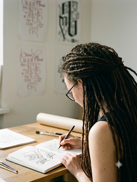
Calligraphy — Slavic, Georgian, Tibetan scripts; brushpen.
Design College #21 — graphic design, 2012–2014 (diploma on branding & brand strategy through archetypes).
ArtGorbunov / Bureau School — product & interface design, 2015.
Aviation Institute (MAI) — MSc, Applied Mathematics & Computer Science.
Languages
English · Georgian · French · Serbian · Russian · Spanish & Turkish (elementary).
Things you might not guess
I came to posters from mathematics — I still teach it, and it's where my taste for systems, structure and the logic of writing systems comes from.
I once wrote software to calculate background radiation for satellite sensors (Geofizika Kosmos, with physicists).
I built a method for learning several languages at once and designed a primer for it — which is also why the world's alphabets keep turning up in my work, as living systems rather than decoration.